Mish's Global Economic Trend Analysis |

- US ETF Inflows Hit A Record $188B In 2012; Contrarian Indicator or Middle of Bull Run?
- Establishment Survey +155,000 Jobs; Household Survey +28,000 Jobs; Unemployment Rate Revised Up, Flat Since September
- Nikkei Soars as Yen Sinks to 30-Month Low
| US ETF Inflows Hit A Record $188B In 2012; Contrarian Indicator or Middle of Bull Run? Posted: 04 Jan 2013 06:40 PM PST Index Universe reports US ETF Inflows Hit A Record $188B In 2012 Investors poured a record $188 billion into U.S.-listed ETFs in 2012, eclipsing a previous record of more than $175 billion in 2008, as a variety of asset classes shined—including domestic as well as international equities, and particularly fixed income.Top ETFs In 2012 ($, M)  click on table for sharper image Check out the article for more tables and facts. Contrarian Indicator? Noting that the previous inflow high was in 2008 as everything crashed, here is my question: To what extent are these inflows a contrarian warning signal? Perhaps we will find out in 2013. Mike "Mish" Shedlock http://globaleconomicanalysis.blogspot.com |
| Posted: 04 Jan 2013 08:23 AM PST Initial Reaction The establishment survey report of +155,000 jobs was about what most expected. However, beneath the surface, this report looks weak. The household survey shows a gain of a mere 28,000 jobs. The unemployment rate stayed the same although the number of people unemployed rose by 164,000. December BLS Jobs Report at a Glance
Recall that the unemployment rate varies in accordance with the Household Survey not the reported headline jobs number, and not in accordance with the weekly claims data. Quick Notes About the Unemployment Rate
December 2012 Jobs Report Please consider the Bureau of Labor Statistics (BLS) December 2012 Employment Report. Nonfarm payroll employment rose by 155,000 in December, and the unemployment rate was unchanged at 7.8 percent, the U.S. Bureau of Labor Statistics reported today. Employment increased in health care, food services and drinking places, construction, and manufacturing. Click on Any Chart in this Report to See a Sharper Image Unemployment Rate - Seasonally Adjusted  Nonfarm Employment - Payroll Survey - Annual Look - Seasonally Adjusted  Employment is above the total just prior to the 2001 recession, and about where it was in mid-2005. Nonfarm Employment - Payroll Survey Monthly Changes - Seasonally Adjusted  click on any chart for sharper image Between January 2008 and February 2010, the U.S. economy lost 8.8 million jobs. Since the employment low in February 2010, nonfarm payrolls have expanded by about 5.3 million jobs. Of the 8.8 million jobs lost between January 2008 and February 2010, approximately 60.22% have been recovered (not accounting for normal demographic-related job growth). In 2012, employment grew by an average of 153,000 per month, the same as the average monthly gain for 2011. Statistically, 125,000+- jobs a month is enough to keep the unemployment rate flat. For a discussion, please see Question on Jobs: How Many Does It Take to Keep Up With Demographics? Once again, recall unemployment is based on the household survey. Current Report Jobs  Average Weekly Hours  Average weekly hours have improved substantially but are still below where they were at the start of the recession. Index of Aggregate Weekly Hours  The index of aggregate hours paints a good picture of the stall in the recovery. Employment is up, but hours are not up proportionally. Average Hourly Earnings vs. CPI  Average hourly earnings has been falling for years and lagging CPI inflation since September 2009. Simply put real wages have been declining. Add in increases in state taxes and the average Joe has been hammered pretty badly. For further discussion, please see What's "Really" Behind Gross Inequalities In Income Distribution? BLS Birth-Death Model Black Box The BLS Birth/Death Model is an estimation by the BLS as to how many jobs the economy created that were not picked up in the payroll survey. The Birth-Death numbers are not seasonally adjusted, while the reported headline number is. In the black box the BLS combines the two, coming up with a total. The Birth Death number influences the overall totals, but the math is not as simple as it appears. Moreover, the effect is nowhere near as big as it might logically appear at first glance. Do not add or subtract the Birth-Death numbers from the reported headline totals. It does not work that way. Birth/Death assumptions are supposedly made according to estimates of where the BLS thinks we are in the economic cycle. Theory is one thing. Practice is clearly another as noted by numerous recent revisions. Birth Death Model Adjustments For 2011  Birth Death Model Adjustments For 2012  Birth-Death Notes Once again: Do NOT subtract the Birth-Death number from the reported headline number. That approach is statistically invalid. In general, analysts attribute much more to birth-death numbers than they should. Except at economic turns, BLS Birth/Death errors are reasonably small. For a discussion of how little birth-death numbers affect actual monthly reporting, please see BLS Birth/Death Model Yet Again. Household Survey Data  click on chart for sharper image In the last year, the civilian noninstitutional population rose by 3,766,000. Yet the labor force only rose by 1,566,000. Those "not" in the labor force rose by 2,199,000 to 88,839,000. The massive rise of those "not" in the labor force is primarily economic weakness, not demographics. Actually, older workers are returning to the work force because they cannot afford retirement. One look at the average age of Walmart greeters and those working in fast food restaurants tells a story itself. Decline in Labor Force Factors
Were it not for people dropping out of the labor force, the unemployment rate would be well over 10%. Part Time Status (in Thousands)  click on chart for sharper image There are 7,918,000 workers who are working part-time but want full-time work. This is a volatile series. BLS Alternate Measures of Unemployment  click on chart for sharper image Table A-15 is where one can find a better approximation of what the unemployment rate really is. Notice I said "better" approximation not to be confused with "good" approximation. The official unemployment rate is 7.8%. However, if you start counting all the people who want a job but gave up, all the people with part-time jobs that want a full-time job, all the people who dropped off the unemployment rolls because their unemployment benefits ran out, etc., you get a closer picture of what the unemployment rate is. That number is in the last row labeled U-6. U-6 is much higher at 14.4%. Both numbers would be way higher still, were it not for millions dropping out of the labor force over the past few years. Duration of Unemployment  Long-term unemployment remains in a disaster zone with 39% of the unemployed in the 27 weeks or longer category. Grossly Distorted Statistics Given the complete distortions of reality with respect to not counting people who allegedly dropped out of the work force, it is easy to misrepresent the headline numbers. Digging under the surface, the drop in the unemployment rate over the past two years is nothing but a statistical mirage. Things are much worse than the reported numbers indicate. Last month shows pronounced weakness in the underlying numbers, this month was weak again. For a look ahead to 2013, please see Small Business Owners' Hiring Intent Plunges to 2008 Lows; Don't Blame Sandy or Fiscal Cliff. Mike "Mish" Shedlock http://globaleconomicanalysis.blogspot.com "Wine Country" Economic Conference Hosted By Mish Click on Image to Learn More  |
| Nikkei Soars as Yen Sinks to 30-Month Low Posted: 03 Jan 2013 11:15 PM PST Inquiring minds note the Nikkei is up 293 points (2.8%) to 10,688 as the Japanese 30-Year Yield is Highest Since 2011. Thirty-year yields climbed to levels unseen since December 2011, tilting the so-called yield curve to the steepest level in 17 months. Japan's newly installed Prime Minister Shinzo Abe said in a New Year's statement that "bold" monetary policy is one of the three prongs of his economic measures.Yen Weekly 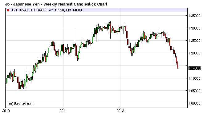 click on chart for sharper image I happen to think Prime Minister Shinzo Abe is serious about causing inflation in Japan. The currency market seems to agree as well. However, the yield on the 30-year bond is only 2%, which is nothing to get that excited over. For now, the bond market is not treating Abe's inflation threat that seriously. If and when the bond market does react, Abe will not like the state of affairs one bit. Mike "Mish" Shedlock http://globaleconomicanalysis.blogspot.com |
| You are subscribed to email updates from Mish's Global Economic Trend Analysis To stop receiving these emails, you may unsubscribe now. | Email delivery powered by Google |
| Google Inc., 20 West Kinzie, Chicago IL USA 60610 | |
No comments:
Post a Comment